04 BLOCK EIGHT


Block Eight is a performance cycling company focused on custom apparel for competitive riders and teams. The identity draws from the visual language of urban cycling culture, combining precision, movement, and tactical performance into a minimal and highly adaptable system.
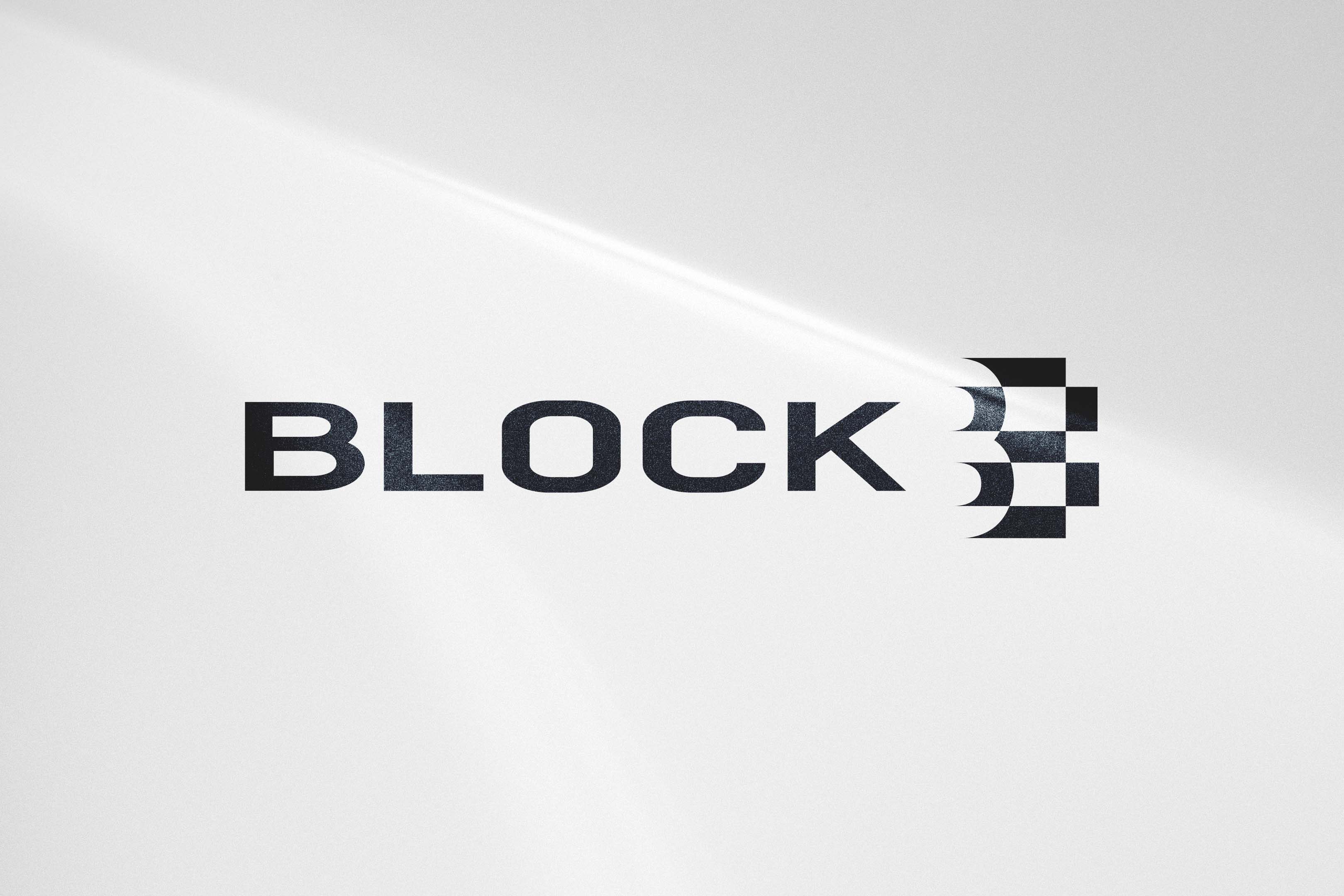
At the center of the identity is a custom symbol designed to function simultaneously as both a “B” and the number “8” through the use of geometric construction and negative space. The checkered structure references race flags and finish lines while reinforcing the “block” concept embedded within the brand name itself.
The naming strategy draws from two key ideas within cycling culture: “blocking,” a tactical racing technique used to create competitive advantage, and “block training,” a structured endurance training method commonly used by cyclists. Together, the references position the brand around discipline, teamwork, and performance optimization.
The word mark features condensed letterforms inspired by the aerodynamic posture of cyclists in motion. A restrained black-and-white palette reinforces the identity’s urban and performance-driven tone while allowing the apparel system itself to remain highly versatile across applications.
* Authored project - Brand Identity
