03 KREAMKREAM
Identity for KreamKream, a nut butter company where new means everything but the same.
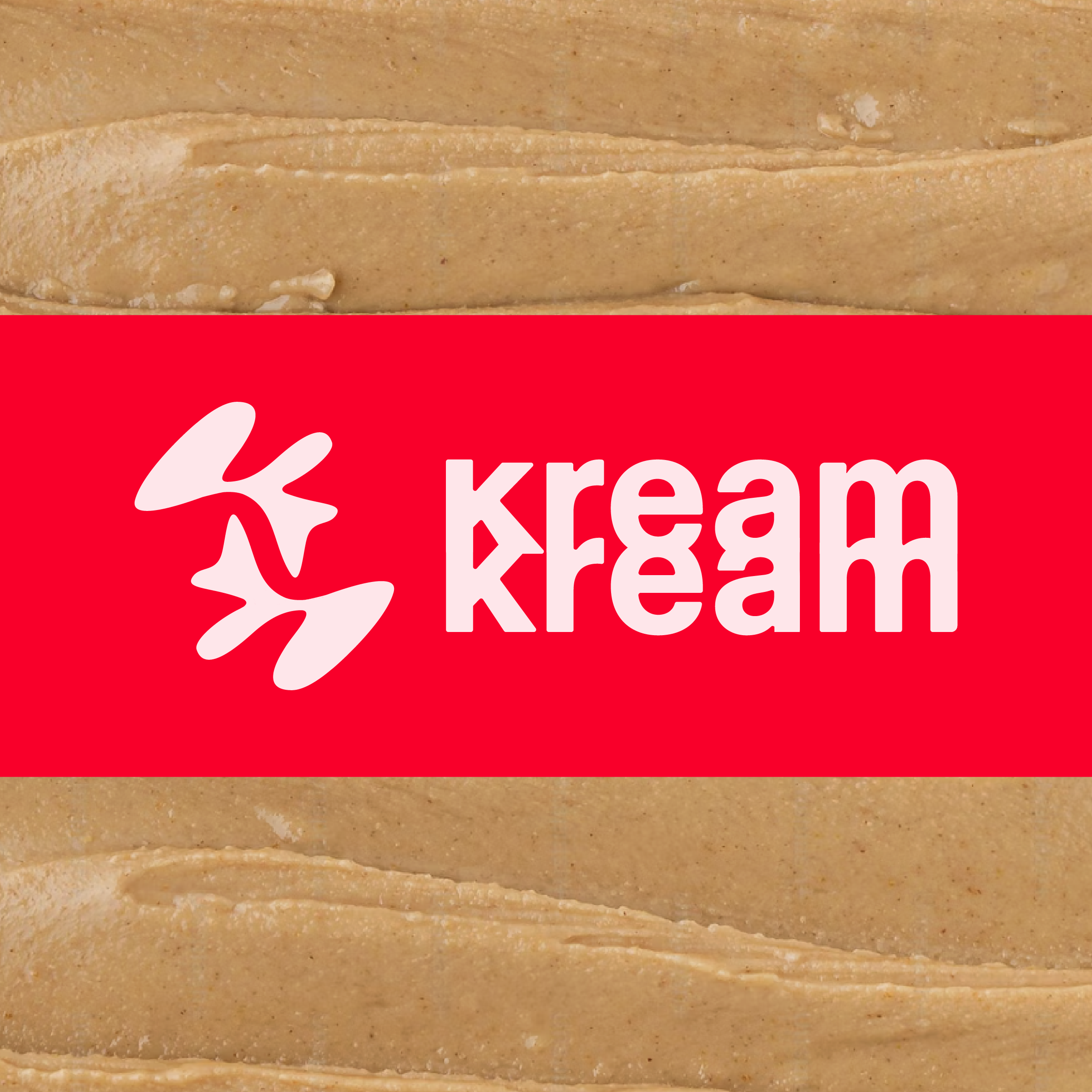
The logomark is representative abstract K’s ( one flipped and reversed ) which mold into a playful flow of “kream” that is so central to the brand product’s essence. The logomark and the wordmark are each layered, just as cream layers upon itself in use.
The strength of the logo carries the brand’s core message - stepping boldly and simply into “presence” - or that state of which our nature flows - the health over the hustle. With clean ingredients, no fillers, or fake energy additives, KreamKream products provide energy that sustains rather than spikes, so that you can experience the trueness of your butter better.
Every jar is a daily reminder of the opportunity to slow down and refocus on what really matters. As the company likes to put it - “ Stop striving, start kreaming”.
* Authored project - Brand Identity