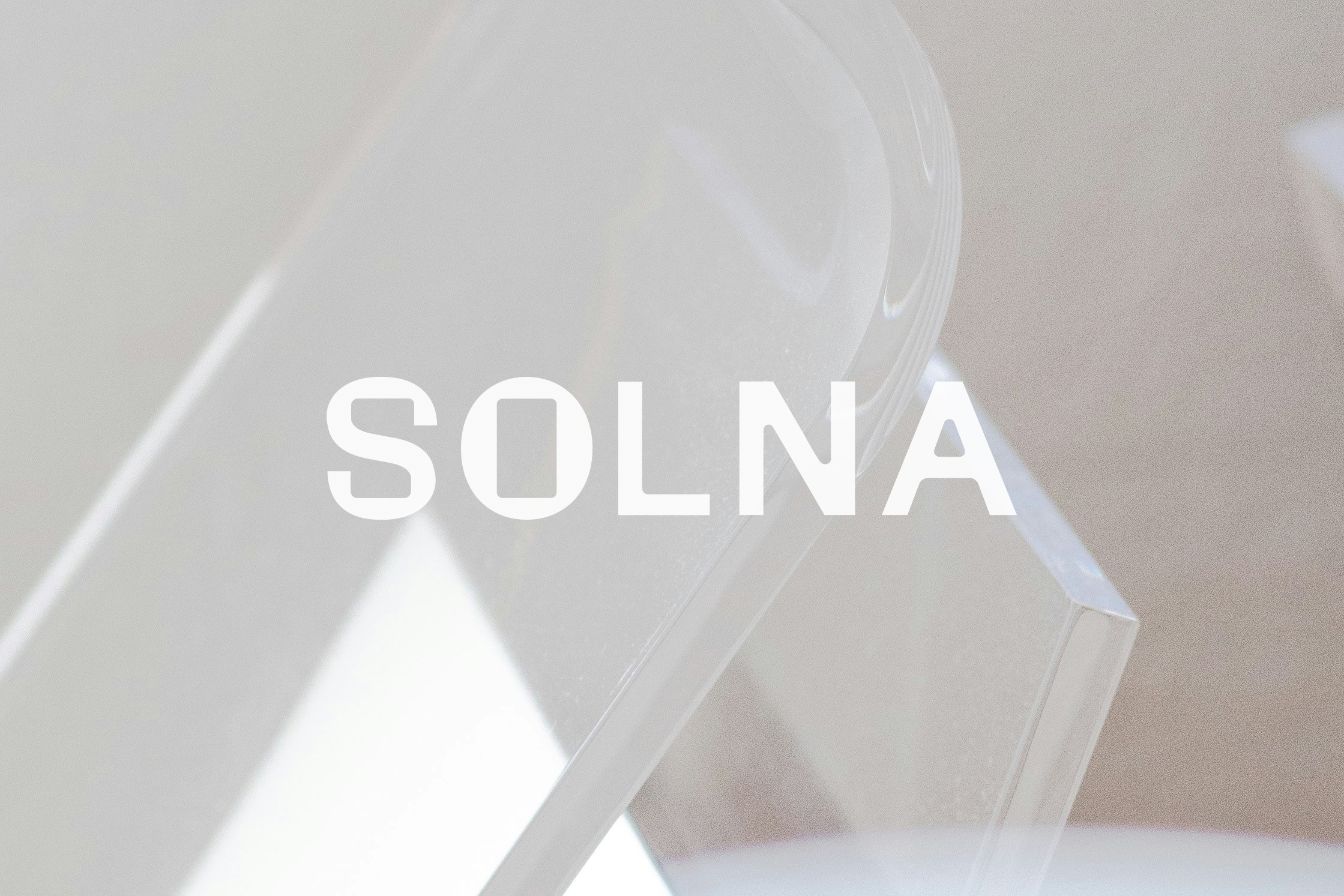
05 SOLNA
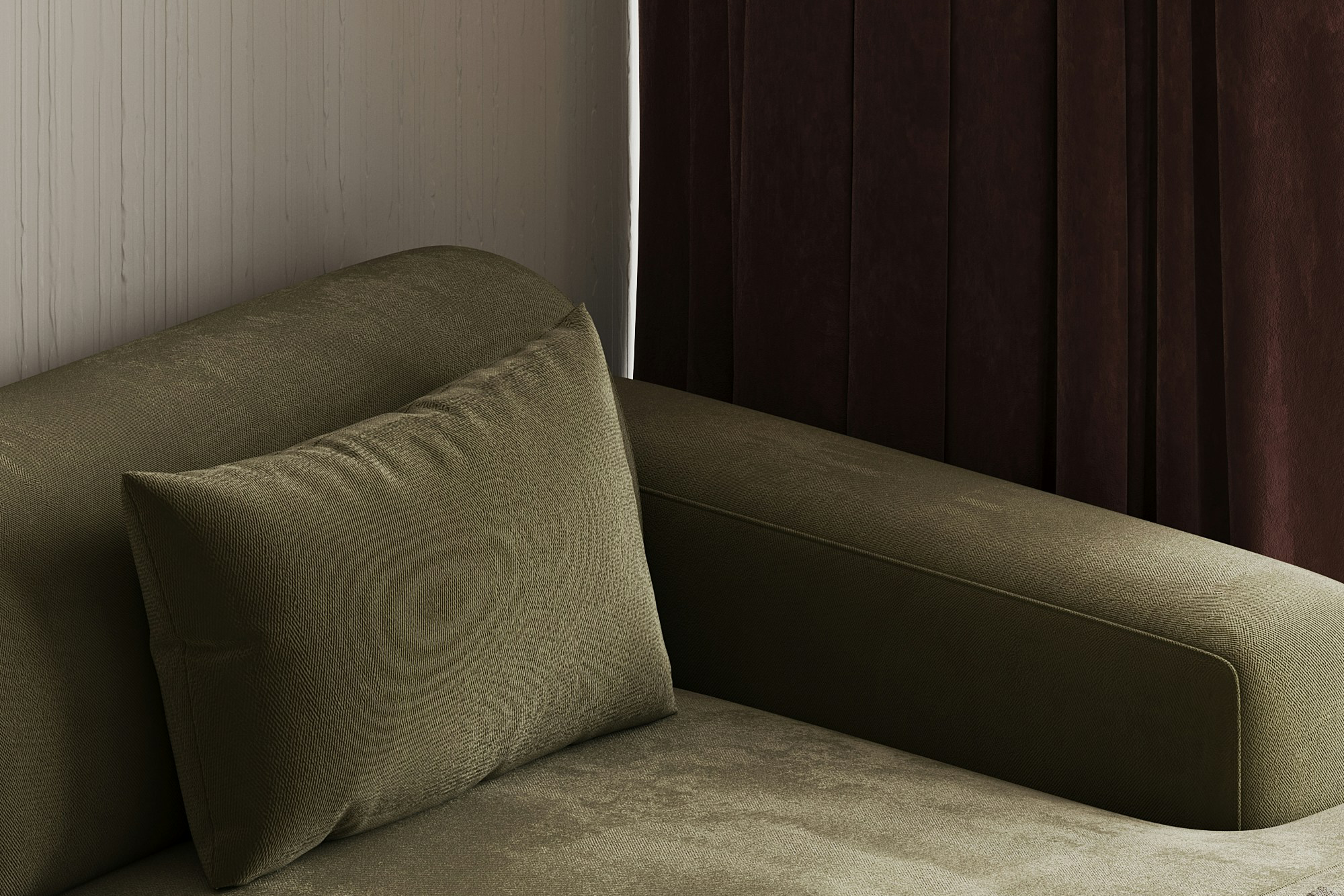
Visual identity for Solna, a furniture and home accessories brand defined by clarity, strength, and calm. Every piece balances bold form with minimal expression — sculptural yet simple, refined yet grounded. Solna believes that great design doesn’t shout; it speaks quietly with confidence.
Rooted in the principles of modern minimalism, Solna celebrates space, proportion, and material honesty. Each design strips away excess to reveal what truly matters — form, function, and feeling. The result is furniture that brings both presence and peace into any environment. Solna is also deeply committed to sustainability and ethical craftsmanship. Its collections use responsibly sourced wood, recycled metals, and natural fibers, finished with non-toxic, eco-friendly coatings. Every piece is built to last — designed to be lived with, not replaced.
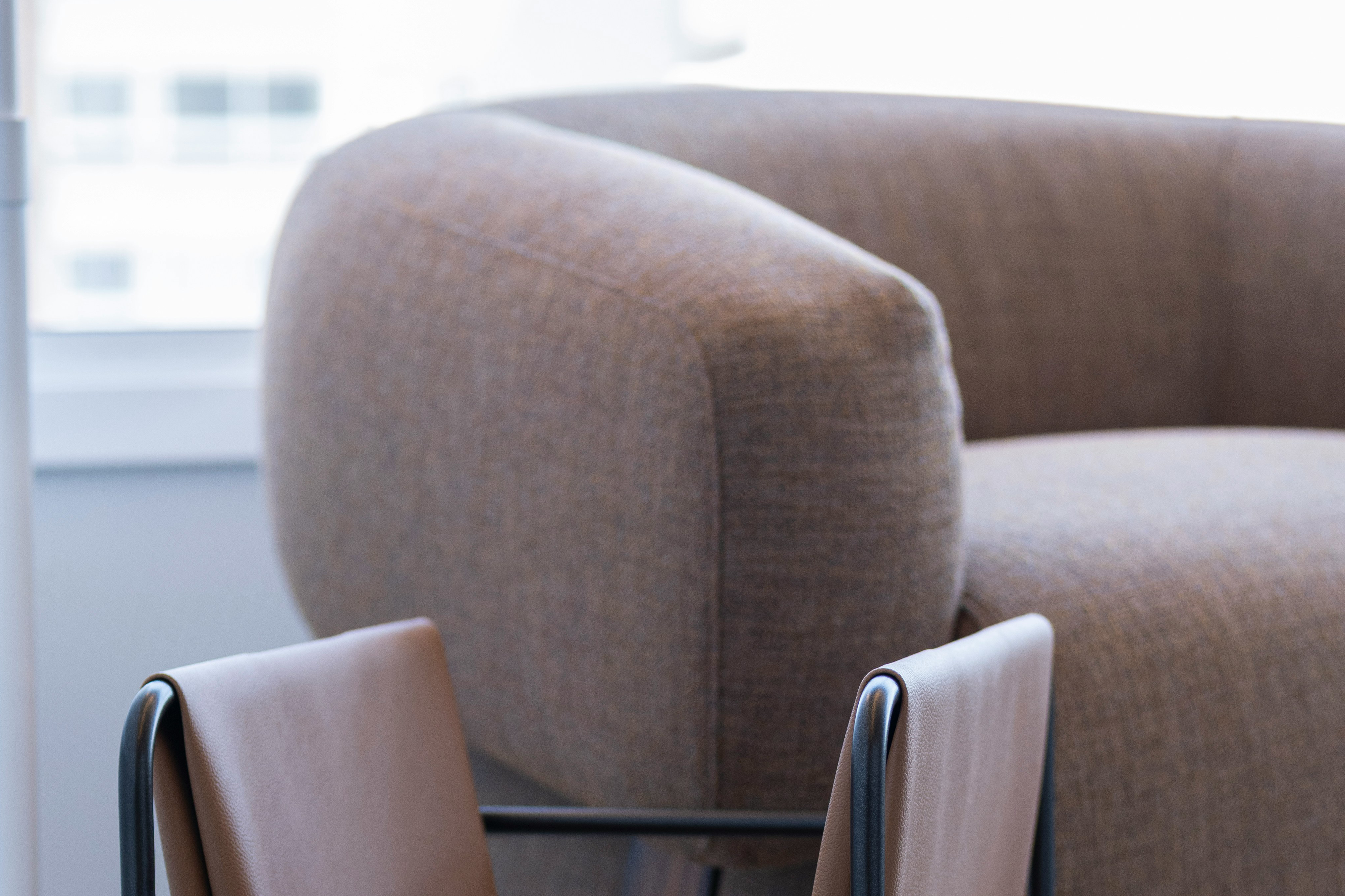
The wordmark and logo for the brand needed to be bold yet inviting to a point - which is where the curved corners within the word come in - but not only are they inviting - they are also representative of the curvature of the craftsmanship that every Solna piece of furniture consists of.
The appropriateness of the logo and future of Solna was dependent on three things -
1. Bold, yet queit, strength.
2. Warm invitation paired with intentional craftsmanship
3. Simplistic groundedness.
The wordmark was designed based on all of the three coming together - and made all the difference for a company needing visual definition to their essence.
* Authored project - Brand Identity
Rooted in the principles of modern minimalism, Solna celebrates space, proportion, and material honesty. Each design strips away excess to reveal what truly matters — form, function, and feeling. The result is furniture that brings both presence and peace into any environment. Solna is also deeply committed to sustainability and ethical craftsmanship. Its collections use responsibly sourced wood, recycled metals, and natural fibers, finished with non-toxic, eco-friendly coatings. Every piece is built to last — designed to be lived with, not replaced.
The wordmark and logo for the brand needed to be bold yet inviting to a point - which is where the curved corners within the word come in - but not only are they inviting - they are also representative of the curvature of the craftsmanship that every Solna piece of furniture consists of.
The appropriateness of the logo and future of Solna was dependent on three things -
1. Bold, yet queit, strength.
2. Warm invitation paired with intentional craftsmanship
3. Simplistic groundedness.
The wordmark was designed based on all of the three coming together - and made all the difference for a company needing visual definition to their essence.
* Authored project - Brand Identity