01 THROVE


Throve is a social media strategy agency focused on helping creators and businesses grow their online presence with intentionality and balance. The agency promotes a healthier approach to digital growth by combining audience development strategies with mindful platform engagement.
The name “Throve” merges the ideas of thriving and growth, reflecting the agency’s belief that sustainable online success should support both performance and well-being.
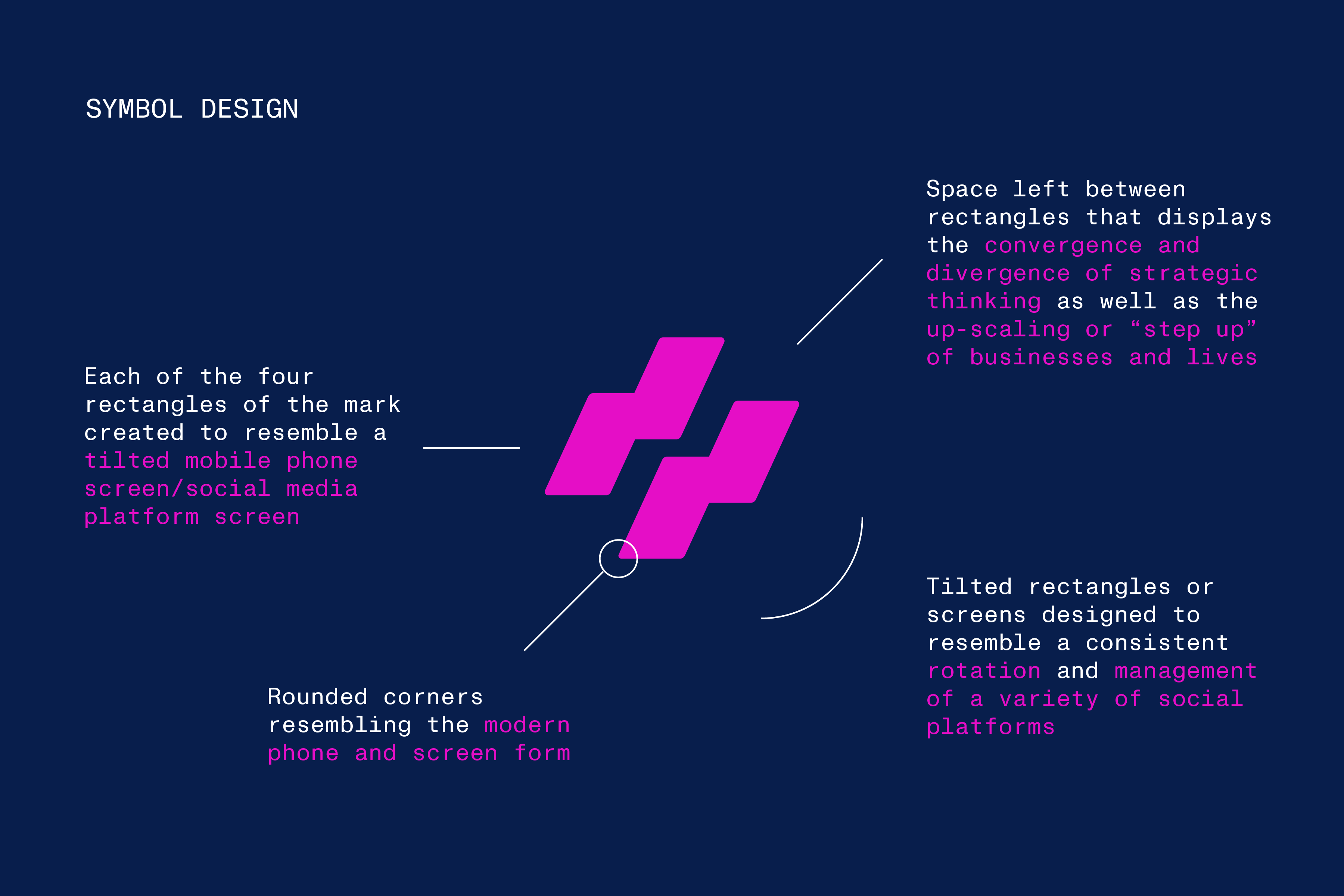
The visual identity centers around a modular symbol inspired by mobile interfaces and rotating social media feeds. The mark uses layered geometric forms and negative space to represent momentum, scalability, and upward cultural movement. A repeating pattern system extends the concept further, symbolizing the ripple effect of meaningful digital engagement.
A bold fluorescent pink was selected to capture attention within fast-moving digital environments while resonating with younger audiences most impacted by contemporary social media culture.
* Authored project - Brand Identity
The name “Throve” merges the ideas of thriving and growth, reflecting the agency’s belief that sustainable online success should support both performance and well-being.
The visual identity centers around a modular symbol inspired by mobile interfaces and rotating social media feeds. The mark uses layered geometric forms and negative space to represent momentum, scalability, and upward cultural movement. A repeating pattern system extends the concept further, symbolizing the ripple effect of meaningful digital engagement.
A bold fluorescent pink was selected to capture attention within fast-moving digital environments while resonating with younger audiences most impacted by contemporary social media culture.
* Authored project - Brand Identity